Every Other AI Image Model Has a Text Problem. P-Image Ideogram Does Not.
You describe the poster. You include the headline. You run the generation. The text comes out wrong. That is the experience with most AI image models. P-Image Ideogram is built specifically for the work where that is not acceptable.
You have done it before. You describe the poster, include the headline in the prompt, run the generation, and get back something that looks almost right except the title says "AEPX" instead of "APEX" and the tagline is a sequence of letters that does not mean anything. So you open Photoshop, remove the text, add it back manually, and ship it.
That workaround has become so normal that most people do not even think of it as a workaround anymore. It is just the AI image workflow.
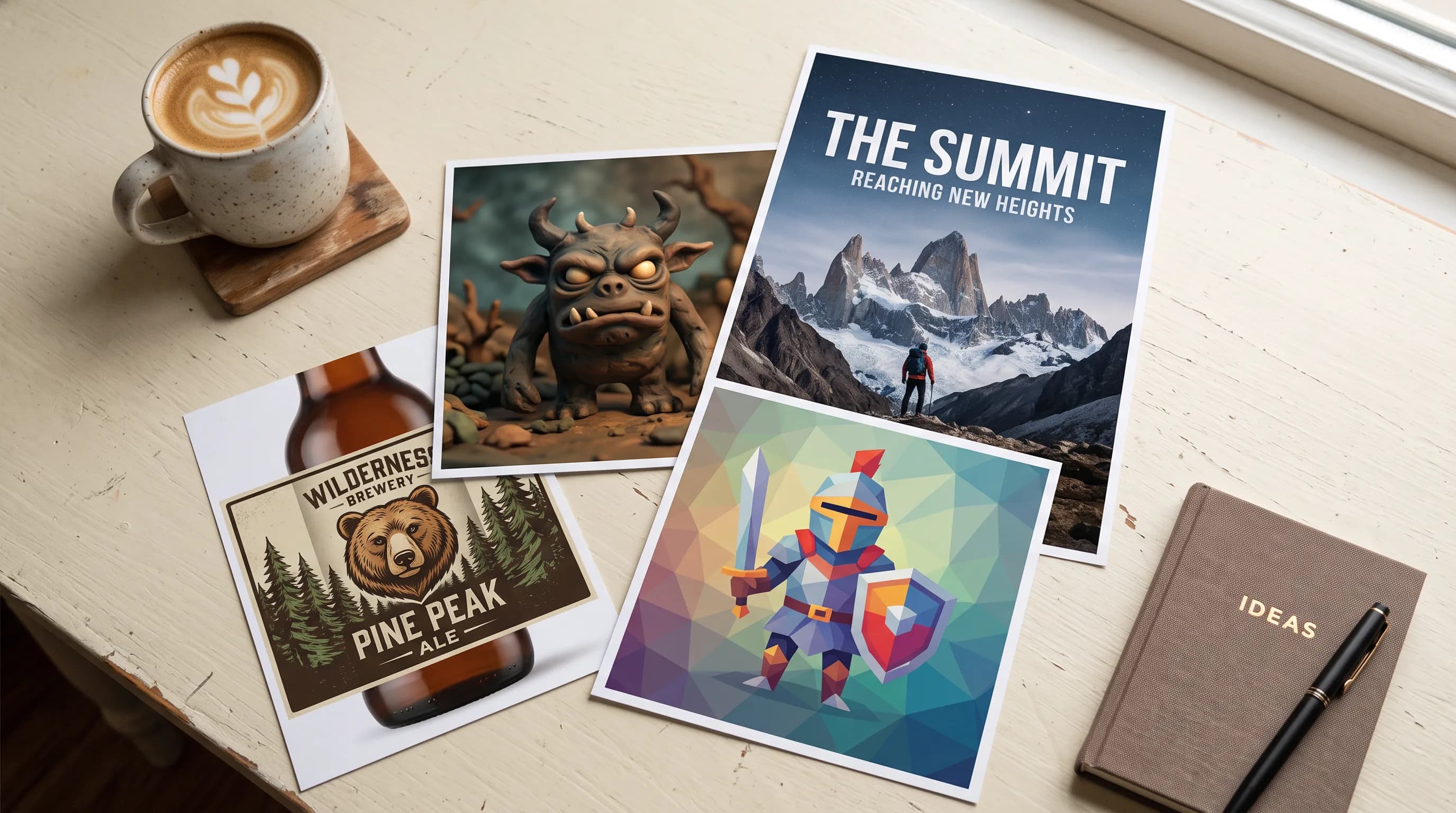
P-Image Ideogram by Pruna AI is built for the work where that is not acceptable. Posters, packaging, logos, menus, book covers, album art, social graphics: any designed output where the words are part of the composition and need to come out right. Here is what it does and why it is worth knowing.
The Text Rendering Is the Point
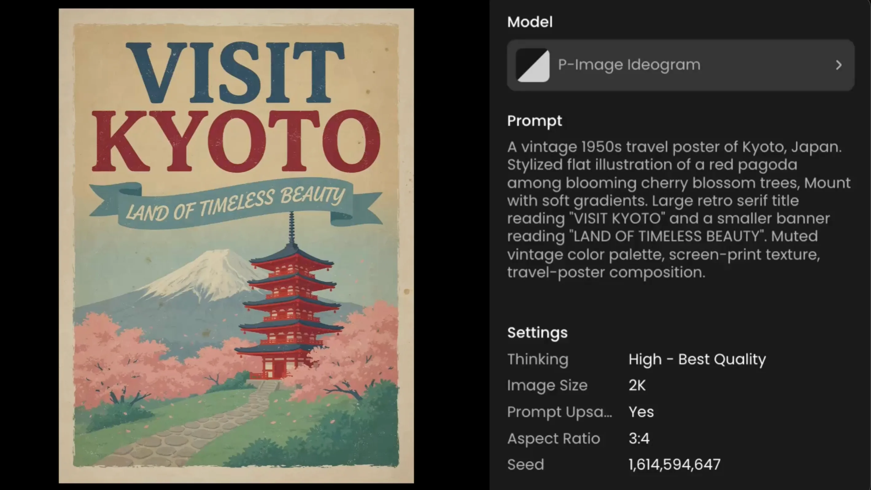
Put the exact words you want in quotation marks inside the prompt. Describe where they sit and how they look. The model lays out clean, correctly spelled type across however many lines the design requires: headline, subtitle, credits, tagline, prices, fine print.
This is not a minor improvement over what other models do. It is a different category of result. A headline that says exactly what you told it to say. A tagline that reads correctly at any size. A label with a brand name that does not have a random character swapped in.
The Thinking Control
Thinking is the main dial between quality and cost. It sets how much reasoning effort the model spends before rendering, and it directly affects how well the text comes out.
High is the default and the right choice for anything with small type, multi-line layouts, fine print, or final production art. Best quality, best text accuracy.
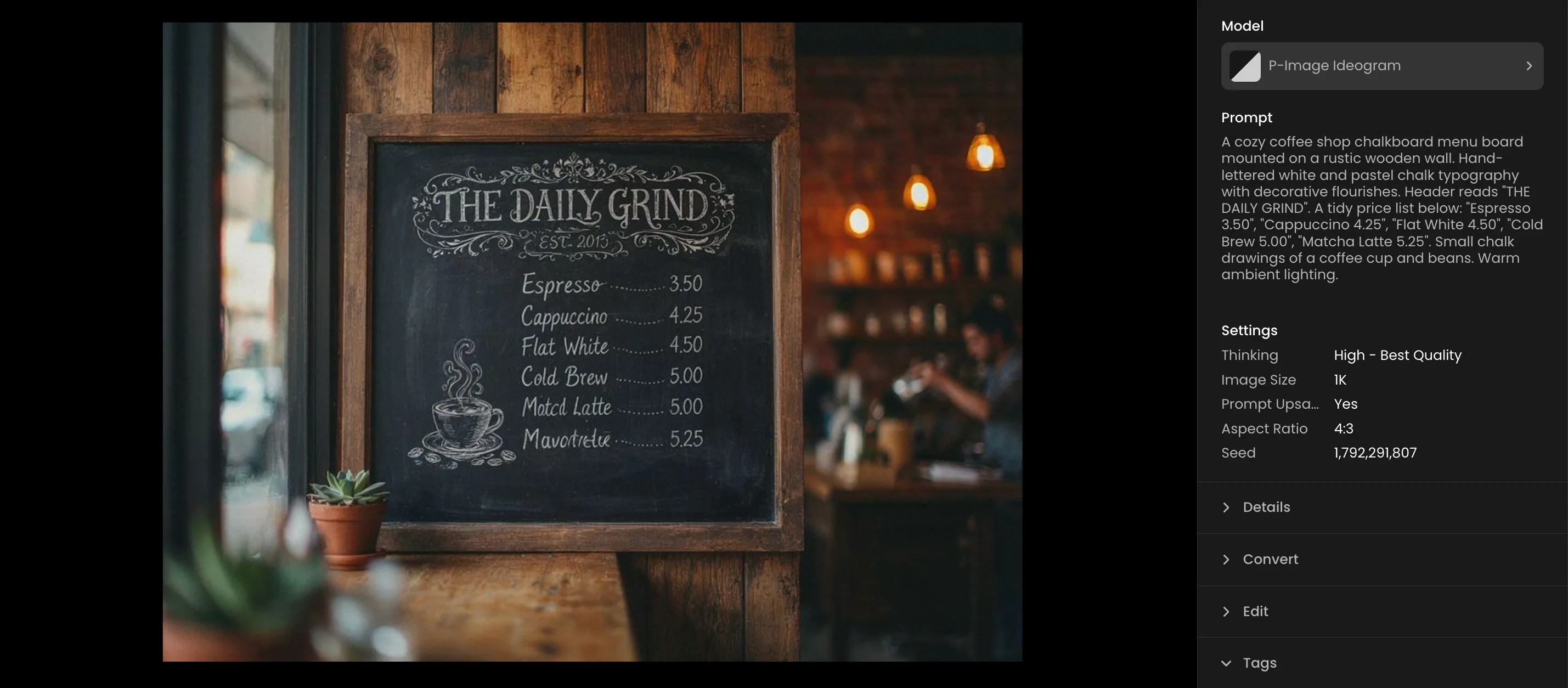
Medium is a good middle ground for illustrative work where text is secondary. Occasional single-letter slips on longer words, but generally fine for non-critical copy.
Low and Very Low are the fast, cheap options. Big headlines stay crisp. Small secondary text starts to ghost and smear. Good for rough drafts and anything where the only text is a single bold word. Not for anything with dense or small copy.
The rule: if the text matters, use High. If you are iterating and the text is approximate, drop it down and save the cost for the final run.
Prompt Upsampling
Prompt Upsampling enriches the prompt with extra detail before generating. It is on by default and on this model it matters more than usual.
Testing shows the difference clearly: same prompt, same seed, same everything else, Prompt Upsampling on versus off. With it on: clean typography, title and subtitle render correctly. With it off: the lettering collapses into gibberish. It is not a subtle difference. Leave it on.
The one tradeoff worth knowing: because upsampling rewrites the prompt, it can add copy you did not ask for. A poster might gain invented credits or a date. For mockups this is usually fine, sometimes even helpful. If you need only your exact words and nothing else, keep the prompt tight so the model has less room to invent.
Beyond Text: Cinematic Range and Art Styles
Text rendering is the headline but P-Image Ideogram is also a capable general image model.
Camera and lens language in the prompt shapes the composition the way it should. Low angle, Dutch angle, fisheye, telephoto compression, aerial top-down: name the framing and the model follows it. Useful for anything where the photographic direction is part of the brief.
Art styles commit properly when you name them. Low-poly comes out with clean faceted geometry, not a vague approximation of it. Claymation produces plasticine texture with sculpting marks. Papercraft delivers layered cut-paper edges and drop shadows. For game concepting and product design work across different visual treatments, the same model that generates a polished event poster can produce a low-poly game asset or a claymation character in the same session without switching tools.
What It Is Good For
Anywhere a design needs words and visuals to work together in the same frame: event posters, packaging, product labels, game key art, book covers, album art, movie posters, menu boards, social ad creatives, infographics. The common thread is that the text is part of the composition, not something you add afterward. That is what P-Image Ideogram is built for.
Try P-Image Ideogram on Scenario
FAQ
What makes P-Image Ideogram different from other image models?
In-image text rendering. Put exact words in quotes in the prompt and they come out clean, correctly spelled, and properly placed. Headline, subtitle, tagline, fine print in one generation without manual text correction afterward.
How do I get accurate text?
Put the exact words in quotation marks. Describe where they sit. Keep Prompt Upsampling on. Use Thinking High for anything with small or dense type.
What is the Thinking setting for?
It controls reasoning effort before rendering. High gives the best text accuracy and quality. Lower tiers are faster and cheaper but degrade small text. Use High for final art.
Should I leave Prompt Upsampling on?
Yes. Turning it off collapsed text rendering into gibberish in testing. Leave it on.
Does it accept reference images?
No. Text-to-image only. No image input, no negative prompt, no style presets.
What output resolution is available?
1K or 2K. Custom dimensions up to 2560px per side, 6 megapixel total limit.
What aspect ratios are supported?
Seven presets: 9:16, 2:3, 3:4, 1:1, 4:3, 3:2, 16:9, plus Custom for exact pixel dimensions.